Feature Split Section
Split layout feature section
Overview
A split layout for feature highlights. The text column includes a tag, badge, title, description, optional bullet list, and CTA. The image can be a standard <img> or a CSS background image. Supports imagePosition to flip the layout.
Usage
import { FeatureSplitSection } from "@leanicon/web-builder-library";Image right (default)
Ship faster with our platform
Everything you need to build and launch marketing pages quickly. Our drag-and-drop builder, pre-built blocks, and one-click publishing make it simple.

Image left
Set imagePosition="left" to flip the layout.
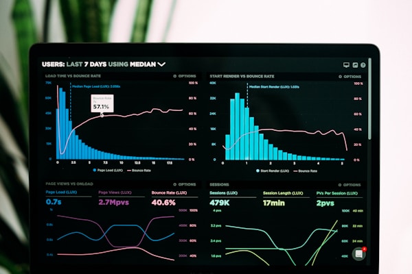
Powerful analytics built in
Understand how your visitors interact with your pages. Track conversions, measure performance, and optimise for results.
With tag and features list
Add tag for an uppercase label and features for a bullet checklist.
Launch personalized outbound campaigns in minutes
Instantly pinpoint the right buyers with real-time data. Then use simple AI prompts to automate full-funnel, multichannel campaigns in just a few clicks.
- Real-time data and signals to pinpoint your perfect leads
- AI Assistant to build lists and campaigns from scratch using natural language
- Built-in deliverability tools to keep your domain safe

With tag and features — image right
Connect with more prospects in less time
Start each day with a prioritized list of the most important actions so you can focus on conversations that move the needle.
- Task prioritization & call scripts to convert more leads
- Built-in parallel dialer to connect with more prospects faster
- Chrome extension to execute tasks anywhere on the web
- AI-powered insights and follow-ups to make the most of every meeting

With badge and CTA

With background image
Use backgroundImage instead of a standard image for a full-bleed CSS background.
CTA outline variant
Dark mode
With features — dark mode
Launch personalized outbound campaigns in minutes
Instantly pinpoint the right buyers with real-time data. Then use simple AI prompts to automate full-funnel, multichannel campaigns in just a few clicks.
- Real-time data and signals to pinpoint your perfect leads
- AI Assistant to build lists and campaigns from scratch using natural language
- Built-in deliverability tools to keep your domain safe
Image right — dark mode
Ship faster with our platform
Everything you need to build and launch marketing pages quickly. Our drag-and-drop builder, pre-built blocks, and one-click publishing make it simple.
Props
Prop | Type | Default | Description |
|---|---|---|---|
|
| — | Section title (required) |
|
| — | Section description (required) |
|
| — | Feature image (required) |
|
| — | Uppercase monospace label above the title |
|
| — | Badge pill above the title |
|
| — | Bullet checklist with optional custom icons |
|
| — | Call-to-action button |
|
| — | CSS background image URL (replaces standard |
|
|
| Which side the image appears on |
|
| — | Force light or dark mode |
|
| — | Additional CSS classes on root |
FeatureSplitItem
Field | Type | Description |
|---|---|---|
|
| Custom icon — defaults to a |
|
| Feature text (required) |
Notes
tagrenders as monospace uppercase text;badgerenders as aBadgepill. Use one or the other.featuresitems default to a greenCheckIconif no custom icon is provided.backgroundImagerenders a CSSbackground-imagediv instead of an<img>— useful for full-bleed hero-style imagery.- The CTA button variant defaults to
"outline"in light mode and"default"in dark mode. Override viacta.variant. - Dark mode: pass
colorScheme="dark"or place inside a.darkancestor.
Props
| Name | Type | Default | Required | Description |
|---|---|---|---|---|
title | string | — | Yes | |
description | string | — | Yes | |
image | ImageProps | — | Yes | |
tag | string | — | No | |
cta | CTAButton | — | No | |
badge | string | — | No | |
features | FeatureSplitItem[] | — | No | |
backgroundImage | string | — | No | |
imagePosition | enum | right | No | |
colorScheme | enum | — | No | |
animation | FeatureSplitSectionAnimation | — | No | |
className | string | — | No |