Feature Tabs
Tabbed feature showcase
Overview
Displays a set of feature tabs, each with a title, description, optional bullet list, image, and CTA. Supports three visual styles (bar, pills, accordion) and an optional auto-rotation timer.
Usage
import { FeatureTabs } from "@leanicon/web-builder-library";Bar variant (default)
Full-width tab strip with bordered triggers.
Powerful Analytics
Understand your users with real-time dashboards and in-depth reporting tools that help you make data-driven decisions.
Explore analytics- Real-time dashboards with custom widgets
- Funnel analysis and conversion tracking
- Exportable reports in PDF and CSV
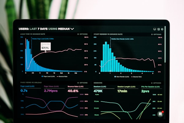
Bar — sharp corners
Powerful Analytics
Understand your users with real-time dashboards and in-depth reporting tools.
- Real-time dashboards
- Funnel analysis
- Exportable reports
Bar — auto-rotating
Set autoRotate with a rotationInterval (in ms) to cycle through tabs automatically.
Powerful Analytics
Real-time dashboards and reporting tools.
Bar — auto-rotating with fill progress
Set progressStyle="fill" to use the progress as a background fill on the active tab instead of a bottom bar.
Powerful Analytics
Real-time dashboards and reporting tools.
Pills variant
Centered pill buttons with an optional section header.
Put AI to work
No matter the team, and no matter the task, our platform frees your teams to focus on the work that propels your business forward.
Powerful Analytics
Understand your users with real-time dashboards and in-depth reporting tools.
- Real-time dashboards with custom widgets
- Funnel analysis and conversion tracking
- Exportable reports in PDF and CSV
Pills — sharp corners
Put AI to work
Powerful Analytics
Real-time dashboards and reporting.
Accordion variant
Vertical accordion list on the right, image panel on the left.
Our models. All business.
Understand your users with real-time dashboards and in-depth reporting tools.
- Real-time dashboards with custom widgets
- Funnel analysis and conversion tracking
- Exportable reports in PDF and CSV
Accordion — auto-rotating
Auto-rotation works on the accordion variant too. A progress bar appears on the active item's top border. Clicking any tab stops auto-rotation.
Our models. All business.
Understand your users with real-time dashboards and in-depth reporting tools.
- Real-time dashboards with custom widgets
- Funnel analysis and conversion tracking
Bar — dark mode
Powerful Analytics
Real-time dashboards and in-depth reporting tools.
Explore analytics- Real-time dashboards
- Funnel analysis
- Exportable reports
Pills — dark mode
Put AI to work
No matter the team, our platform frees your teams to focus on the work that propels your business forward.
Powerful Analytics
Real-time dashboards and reporting.
- Custom widgets
- Funnel analysis
- PDF/CSV export
Accordion — dark mode
Our models. All business.
Real-time dashboards and in-depth reporting.
- Custom widgets
- Funnel analysis
- PDF/CSV export
Variants
Variant | Description |
|---|---|
| Full-width tab strip with bordered triggers (Apollo.io style) |
| Centered pill buttons with optional section header |
| Vertical accordion list on the right; image panel on the left |
Props
Prop | Type | Default | Description |
|---|---|---|---|
|
| — | Array of tab data (required) |
|
|
| Visual style |
|
| — | Heading + optional subheading above the tabs |
|
|
| Auto-cycle through tabs |
|
|
| Interval in ms between auto-rotations |
|
|
| Transition animation duration in ms |
|
|
| Auto-rotate progress: bottom bar or background fill |
|
|
| Border-radius style for triggers and images |
|
| — | Force light or dark mode |
|
| — | Additional CSS classes on root |
FeatureTab
Field | Type | Description |
|---|---|---|
|
| Tab trigger text (required) |
|
| Panel heading (required) |
|
| Panel description (required) |
|
| Bullet checklist |
|
| Panel image |
|
| Call-to-action button |
Notes
- Auto-rotation works on all three variants. The accordion shows a progress bar on the active item's top border.
- Auto-rotation stops permanently when the user manually clicks any tab.
corners="sharp"affects both the tab triggers and the panel images.- Dark mode: pass
colorScheme="dark"or place inside a.darkancestor.
Props
| Name | Type | Default | Required | Description |
|---|---|---|---|---|
variant | enum | bar | No | |
tabs | FeatureTab[] | — | Yes | |
sectionHeader | SectionHeader | — | No | |
autoRotate | boolean | false | No | |
rotationInterval | number | 5000 | No | |
transitionDuration | number | 300 | No | |
progressStyle | enum | bar | No | |
corners | enum | rounded | No | |
colorScheme | enum | — | No | |
className | string | — | No |